02 - Exploratory Data Analysis - DATS
02 - Exploratory Data Analysis - DATS
Statistical analysis of experiments starts with graphical and non-graphical Explanatory Data Analysis (EDA)
EDA always precedes formal (confirmatory) data analysis.
Characteristic:
- Numeric
- Factor (qualitative) - ex. Gender {1,2,3} -->
- Categories (Levels in R) - Absolute or relative
Univariant Explanatory Data Analysis
We take each column one by one and we summarize it.
How can we summarize different variables types
- Factor variable
- Numbers - counting the occurrences of each category
- Charts - Bar plot, Pie chart - Always use a new structure that contains, at leas, the counting (ex
barplot(table(var)))
- Numeric variable
- Numbers - We distinguish the central and the dispersion (spread)
Summarize(var)--> into 5 numbers:- min
- Q1 (first quartile)
- Mean
- Q2 (percentile of 50%) = Median
- Q3 (third quartile)
- max
- Charts: Histogram, boxplot (helps identify outliers)
- Numbers - We distinguish the central and the dispersion (spread)
Robustness of an indicator
Classic Statistic
A classic statistic or indicator is one that is higly influenced by the presence of one or more outliers
Robust Statistic
A Robust statistic or indicator is one that is NOT higly influenced by the presence of one or more outliers
Numeric indicators
-
#Central Tendency
-
#Dispersion or Spread
Central Tendency
Mean
#Classic Statistic
Simple mean (Also known as average although it is not a mathematical concept)
It indicates some sort of central trend. It is also known as the expected value: It's the outcome of a variable when the observations get close to infinity.
Quartiles
Median
Median is a #Robust Statistic
It's the second quartile
median = Q2
It's the value that splits the sample in 2 parts:
- 50% of the observation are less than the median
- 50% of the observation are greater than the median
Q1 - Q3
#Robust Statistic
- Q1: 25% of observation are less than Q1 & 75% are greater than Q1
- Q3: 75% of observation are less than Q3 & 25% are greater than Q3
Dispersion or spread
The spread of a distribution mostly refers to the #Variance or the #Standard Deviation.
Variance
It's a #Classic Statistic (it's very affected by outliers)
Variance has squared units so it's difficult to interprete. So we use standard deviation
Standard Deviation
See also: 04 - Statistica - Idro#Deviazione Standard, 03 - Statistica in Topografia - TP#Deviazione Standard
It's a #Classic Statistic (it's very affected by outliers)
IQR - Inter Quartile Range
It's a #Robust Statistic
It indicates how spread apart the observation are.
Skewness and Kurtosis
Skewness
The skewness is a measure of asymmetry of a distribution.

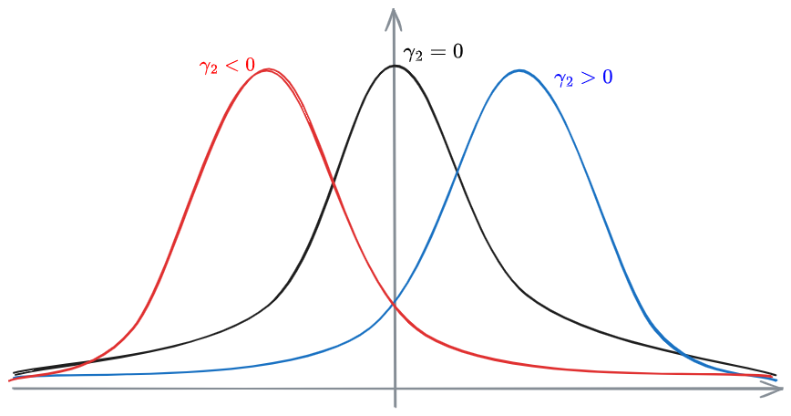
Kurtosis
The Kurtosis of a distribution measures how far away a distribution is from a Gaussian distribution in terms of peakedness vs flatness.
Rounder shoulders and thin tails compared to a Gaussian distribution More sharply shaped picks and fat tails compared to a Gaussian distribution
Moments

Numeric charts
Boxplot


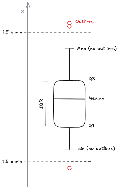
The boxplot is a particular plot useful to understand the central tendency of the data.
- BOX
- Whiskers - the lines that exit the box
- They indicate the minimum and maximum value of the data, without considering the #Outliers
- Every data point that is over 1.5 the distance between the box edge and the whisker end, is considered an outlier and is plotted on its own
Assuming there are no outliers, the whiskers indicate the min and the max.
Quantile-Quantile plot - QQ plot
The QQ plot is used to see how well a particular data sample follows a particular theoretical distribution.
A Quantile-Quantile Plot (QQ Plot) is a graph of the standard model quantiles
versus
If
Bivariate Explanatory Data Analysis
2 variables:
we are interested in:
- Coefficient of correlation
- Pearson:
- Spearman (suitable with integral data, order values not normally distributed: non-parametric statistics)
- Pearson:
Correlation
It's adimensional.
the coefficient of correlation ranges between:
If
The sign indicates how the relation is working.
The pearson coefficient is given by:
Charts
- Scatter plot
- Scatter graph
❗❗❗❗❗❗❗❗❗❗❗❗
❗❗❗ COMPLETARE ❗❗❗
❗❗❗❗❗❗❗❗❗❗❗❗ tutta la parte da pag 16 delle slide in poi.
- mosaic plot